Written by Jessica Adams.
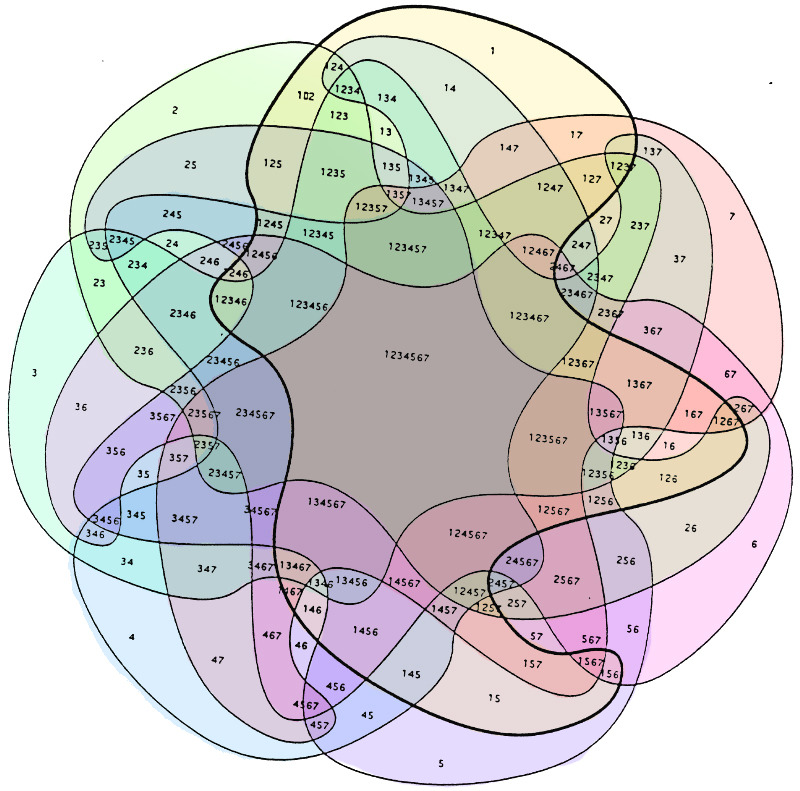
In a bold move to explain her presidency, Vice President Kamala Harris unveiled a “simple” Venn diagram during a press conference. Unfortunately, the diagram, intended to clarify her policies, left the audience more baffled than enlightened. It featured overlapping circles, arrows, and some cryptic symbols that seemed straight out of a complex mathematical theorem.
Harris began her explanation confidently, using phrases like “intersectionality” and “synergistic governance.” However, as she delved deeper into the diagram, it became clear that not even she could navigate the labyrinth of lines and labels. Reporters exchanged puzzled glances, and one was heard whispering, “Is this supposed to make sense?”
Despite the confusion, Harris continued undeterred, occasionally glancing at the diagram as if it were a map to buried treasure. By the end of the presentation, the audience was left with more questions than answers. The attempt to simplify her presidency had backfired spectacularly, proving that sometimes, simplicity is best left to the professionals.
A Lesson in Complexity: How Not to Use Diagrams
The aftermath of Harris’s diagram fiasco was a lesson in how not to use visual aids. Social media erupted with memes and jokes, comparing the diagram to everything from a child’s doodle to an alien language. Even seasoned political analysts struggled to decode the message behind the chaotic circles.
The Venn diagram, meant to showcase the interconnectedness of Harris’s policies, instead highlighted the disarray in her communication strategy. One commentator remarked, “If this is how she explains her presidency, no wonder people are confused about her policies.” The irony was palpable, as a tool designed for clarity had instead sown seeds of further bewilderment.
Critics were quick to point out the overuse of jargon and abstract concepts. “We need straightforward communication,” one political pundit noted, “not a puzzle.” It seems that in her quest to demonstrate her intellectual prowess, Harris had forgotten the golden rule of public speaking: know your audience. The everyday American is not a political scientist, and even they might struggle to grasp the intricacies of such a diagram.
A Humorous Reaction: Social Media Weighs In
The internet, as always, was quick to respond with humor. Twitter users began posting their own versions of the Venn diagram, mocking its complexity. One popular meme featured a Venn diagram with just two circles labeled “Kamala’s Understanding” and “Everyone Else’s Confusion,” with no overlap. Another tweet read, “Kamala Harris just invented a new form of hieroglyphics.”
Even celebrities joined in the fun. Comedian Stephen Colbert joked on his show, “I haven’t been this confused since I tried to assemble IKEA furniture without instructions.” The overwhelming reaction was one of amusement mixed with exasperation.
Harris’s attempt to appear relatable and intelligent had backfired, making her seem out of touch instead. It was a reminder that sometimes, the simplest explanations are the most effective. Her team would do well to remember that before her next public address.
Our Take: Why This Is Bad for the Public
The Harris Venn diagram debacle is more than just a humorous misstep. It highlights a troubling trend in political communication: overcomplicating messages to the point of incomprehensibility. When leaders fail to convey their ideas clearly, the public loses trust and engagement. This is particularly problematic in an era where misinformation is rampant and clarity is crucial.
The irony is that Harris’s intention was to simplify and clarify. Instead, she created more confusion, which can lead to disengagement and apathy among voters. If the public can’t understand their leaders, they can’t hold them accountable. This lack of clarity is bad for democracy and bad for the public.
We need leaders who can communicate complex ideas in straightforward, accessible ways. The ability to do so is not a sign of dumbing down but of respecting the audience’s intelligence. Harris’s team should take this incident as a learning experience and strive for greater transparency and simplicity in the future.
Our Take
The Venn diagram incident reveals a larger issue: the gap between political leaders and the public. When explanations become so convoluted that no one can understand them, it creates a disconnect. This disconnect is dangerous, as it fosters confusion and disengagement. Harris and her team must focus on clear, direct communication. Otherwise, they’ll continue to alienate the very people they’re trying to reach.

